

Simple TriggerAction for docking using GridSplitters
GridSplitters work great if you want to provide a split view between two
views. By dragging the GridSplitter you can adjust the space allocated
to each view. As one view grows in size, the other reduces by the same
size. For most cases, this is exactly what is required. In my case, this
wasn’t enough. In addition to adjusting the splitter, I also wanted a
way to quickly collapse one view and allocate all the space to the other
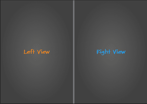
view (a.k.a. Docking). The views were arranged horizontally like so:
To do the collapse action to one side, I added two buttons to the
GridSplitter’s ControlTemplate (shown below). One would collapse the
left-view and the other the right-view.
What you are seeing in the figure above is a Grid with 3 columns. The
middle column is assigned to the GridSplitter. This is an important
assumptionthat I make: that the GridSplitter occupies the center
column (or center row) and there are views to the either side in their
own columns (or rows). This assumption will be used in my custom
TriggerAction, called CollapseAction.
The CollapseAction for the GridSplitter buttons
The idea of collapse is to maximize one of the views and assign zero space to the other view. This can be achieved by adjusting the Widths of the ColumnDefinitions of the containing Grid (or adjusting the Heights of the RowDefinitions). It is probably easier to see it all in code, so here you go:
public class CollapseAction : TriggerAction<Button>
{
    public Dock Direction { get; set; }
    protected override void Invoke(object parameter)
    {
        // First find the nearest splitter
        var splitter = FindVisual<GridSplitter>(AssociatedObject);

        if (splitter != null)
        {
            var grid = FindVisual<Grid>(splitter); // Find nearest Grid
            if (grid != null)
            {
                ApplyDock(grid);
            }
        }
    }

    private void ApplyDock(Grid grid)
    {
        var cDef1 = grid.ColumnDefinitions.FirstOrDefault();
        var cDef2 = grid.ColumnDefinitions.LastOrDefault();
        var rDef1 = grid.RowDefinitions.FirstOrDefault();
        var rDef2 = grid.RowDefinitions.LastOrDefault();
        switch (Direction)
        {
            case Dock.Left:
                cDef1.Width = new GridLength(0);
                cDef2.Width = new GridLength(1, GridUnitType.Star);
                break;
            case Dock.Right:
                cDef2.Width = new GridLength(0);
                cDef1.Width = new GridLength(1, GridUnitType.Star);
                break;
            case Dock.Top:
                rDef1.Height = new GridLength(0);
                rDef2.Height = new GridLength(1, GridUnitType.Star);
                break;
            case Dock.Bottom:
                rDef2.Height = new GridLength(0);
                rDef1.Height = new GridLength(1, GridUnitType.Star);
                break;
        }
    }

    private T FindVisual<T>(FrameworkElement relElt) where T : FrameworkElement
    {
        var parent = VisualTreeHelper.GetParent(relElt);

        while (parent != null && !(parent is T))
        {
            parent = VisualTreeHelper.GetParent(parent);
        }

        return parent as T;
    }
}
The core of the work happens in
the ApplyDock() method. Depending on the Direction, I zero-size one
of the columns/rows and give all the layout-space to the other
column/row. The middle column/row is of fixed-size and is used by the
GridSplitter (as noted earlier). In the ControlTemplate I assign this
action to each of the buttons and set the Direction appropriately. This
can be seen in the following snippet of the GridSplitter’s
ControlTemplate. Note the actions assigned to the Buttons.
<ControlTemplate TargetType="{x:Type GridSplitter}">
    <Border BorderBrush="{TemplateBinding BorderBrush}"
            BorderThickness="{TemplateBinding BorderThickness}"
            Background="{TemplateBinding Background}">
        <Grid Height="Auto">
            <StackPanel x:Name="ColumnsCollapsers"
                        VerticalAlignment="Stretch"
                        d:LayoutOverrides="Height">
                <Button Height="10"
                        Margin="0,3,0,0"
                        Padding="0"
                        Style="{DynamicResource ButtonStyle1}"
                        RenderTransformOrigin="0.5,0.5"
                        Cursor="Arrow">
                    <Button.RenderTransform>
                        <TransformGroup>
                            <ScaleTransform ScaleY="1"
                                            ScaleX="-1" />
                            <SkewTransform AngleY="0"
                                            AngleX="0" />
                            <RotateTransform Angle="0" />
                            <TranslateTransform />
                        </TransformGroup>
                    </Button.RenderTransform>
                    <i:Interaction.Triggers>
                        <i:EventTrigger EventName="Click">
                            <local:CollapseAction />
                        </i:EventTrigger>
                    </i:Interaction.Triggers>
                    <Path Data="M20.500334,30.5 L20.500334,49.166667 35.500332,38.833333 z"
                            Fill="Black"
                            HorizontalAlignment="Center"
                            Height="6"
                            Margin="0"
                            Stretch="Fill"
                            Stroke="{x:Null}"
                            Width="6"
                            StrokeThickness="0"
                            VerticalAlignment="Center" />
                </Button>
                <Button Height="10"
                        Margin="0,3,0,0"
                        Padding="0"
                        Style="{DynamicResource ButtonStyle1}"
                        Cursor="Arrow">
                    <i:Interaction.Triggers>
                        <i:EventTrigger EventName="Click">
                            <local:CollapseAction Direction="Right" />
                        </i:EventTrigger>
                    </i:Interaction.Triggers>
                    <Path Data="M6.4035191E-08,0 L-1.5987212E-14,5.9999996 5.9999999,2.6785712 z"
                            Fill="Black"
                            HorizontalAlignment="Center"
                            Height="6"
                            Margin="0"
                            Stroke="{x:Null}"
                            Width="6"
                            StrokeThickness="0"
                            VerticalAlignment="Center"
                            StrokeLineJoin="Round"
                            Stretch="Fill" />
                </Button>
            </StackPanel>
            <StackPanel x:Name="RowCollapsers"
                        VerticalAlignment="Stretch"
                        d:LayoutOverrides="Height"
                        Orientation="Horizontal"
                        Visibility="Collapsed">
                <Button Height="10"
                        Padding="0"
                        Style="{DynamicResource ButtonStyle1}"
                        RenderTransformOrigin="0.5,0.5"
                        Cursor="Arrow"
                        Width="10"
                        HorizontalAlignment="Left"
                        Margin="3,0,0,0">
                    <Button.RenderTransform>
                        <TransformGroup>
                            <ScaleTransform ScaleY="1"
                                            ScaleX="-1" />
                            <SkewTransform AngleY="0"
                                            AngleX="0" />
                            <RotateTransform Angle="90" />
                            <TranslateTransform />
                        </TransformGroup>
                    </Button.RenderTransform>
                    <i:Interaction.Triggers>
                        <i:EventTrigger EventName="Click">
                            <local:CollapseAction Direction="Top" />
                        </i:EventTrigger>
                    </i:Interaction.Triggers>
                    <Path Data="M20.500334,30.5 L20.500334,49.166667 35.500332,38.833333 z"
                            Fill="Black"
                            HorizontalAlignment="Center"
                            Height="6"
                            Margin="0"
                            Stretch="Fill"
                            Stroke="{x:Null}"
                            Width="6"
                            StrokeThickness="0"
                            VerticalAlignment="Center" />
                </Button>
                <Button Height="10"
                        Padding="0"
                        Style="{DynamicResource ButtonStyle1}"
                        Cursor="Arrow"
                        Width="10"
                        HorizontalAlignment="Left"
                        Margin="3,0,0,0"
                        RenderTransformOrigin="0.5,0.5">
                    <Button.RenderTransform>
                        <TransformGroup>
                            <ScaleTransform />
                            <SkewTransform />
                            <RotateTransform Angle="90" />
                            <TranslateTransform />
                        </TransformGroup>
                    </Button.RenderTransform>
                    <i:Interaction.Triggers>
                        <i:EventTrigger EventName="Click">
                            <local:CollapseAction Direction="Bottom" />
                        </i:EventTrigger>
                    </i:Interaction.Triggers>
                    <Path Data="M6.4035191E-08,0 L-1.5987212E-14,5.9999996 5.9999999,2.6785712 z"
                            Fill="Black"
                            HorizontalAlignment="Center"
                            Height="6"
                            Margin="0"
                            Stroke="{x:Null}"
                            Width="6"
                            StrokeThickness="0"
                            VerticalAlignment="Center"
                            StrokeLineJoin="Round"
                            Stretch="Fill" />
                </Button>
            </StackPanel>
        </Grid>
    </Border>
    <ControlTemplate.Triggers>
        <Trigger Property="ResizeDirection"
                    Value="Rows">
            <Setter Property="Visibility"
                    TargetName="ColumnsCollapsers"
                    Value="Collapsed" />
            <Setter Property="Visibility"
                    TargetName="RowCollapsers"
                    Value="Visible" />
        </Trigger>
    </ControlTemplate.Triggers>
</ControlTemplate>
In action
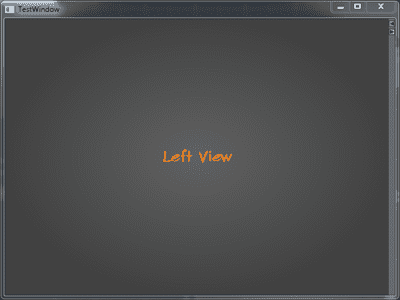
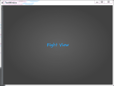
Below you can see the two configurations of docking to the
left and to the right. Note that you can still grab the GridSplitter and
drag to adjust the columns.
Subtle things to note about the GridSplitter
- In the
ControlTemplate, I have added two Buttons and set their Cursor to Arrow. This is required because by default theGridSplitterassigns aCursorofSizeWEorSizeNSdepending on the alignment. When you move the mouse on the Buttons, you continue to get this sizing cursor. This hinders with the usability of the buttons and to aid in the usage, we set the Cursor of the buttons to Arrow. - The
ResizeBehaviorhas been explicitly set toPreviousAndNext. This should make sense now given our earlier assumption. Additionally, theResizeDirectionhas also been set toColumns.